Powerpoint has got to be one of the most common presentation platforms around, and chances are, you have used it before. While this software is commonplace, some of us still struggle to ensure that our slides are succinct and effective. We share ten tips on how to put the POWER in your powerpoint!
1) Title your visuals, such as graphs, flow charts, etc
- The exact point of your presentation should be immediately clear to your audience. Do not keep the audience guessing what the visual is trying to relay
2) Separate individual points
- Text and information should be kept as simple as possible
- Bullet points should be used for information that has no priority, sequence or hierarchy
- For information that requires a sequence, use numbers rather than roman numerals
3) 6 x 6 Rule
- Keep to six words per point and six points per slide. Anything more can cause the slide to be cluttered and audience to get disinterested. For ease of reading, points should be a phrase and not a full sentence.
4) Use colour appropriately
- Try not to use red, green, cyan, yellow, orange, brown in text, as these colours are usually hard to read and affect many people with colour deficiencies
5) Use graphics for emphasis
- Graphs such as flow and process charts help illustrate or explain points better than listing block of words. They help present information in a manner that the audience can better grasp.
6) Contrast between slide background colour & text colour
- There should be a clear contrast so that the text stands out from the slide, eg dark words on light background. However, avoid the reverse, which is a dark background with light coloured text as it is taxing on the eyes.
7) Use Appropriate Type Size & Typeface
- It is best to use a sans serif typeface for projected text.
A well-used sans serif font is Calibri, while Times New Roman is a serif font and difficult to read on the big screen.. - Text size should be large enough to be seen 2 metres from your presentation screen; or use a minimum of font size 18 for text, 24 for subtitles and 30-48 for titles
8) Focus on the key points and ideas
- The general rule of thumb is that it takes about two minutes to present a slide. This means you have just enough time to present 15 slides effectively in an hour.
- Pare down your presentation slides to just the key points and move the rest of the content into the appendix for reference, if needed.
9) Make your titles headlines, not descriptions
- Each section of your slide is a valuable piece of real estate, adding information or insight to the story you're trying to tell. When you use a title that simple describes what's on the slide, you're wasting valuable real estate.
- For example: Titling your slide "Positive Media Stories Q1 2019" is a description and sounds like you are simply listing information. Instead, "Positive Media Stories Rose By 44%!", immediately captures the audience's attention and allows them to more easily grasp what you are about to share.
10) Using images or icons
- The old saying "a picture is worth a thousand words" couldn't be more true when it comes to PowerPoint presentations. Remember, people look at the presentations, they don't read them.
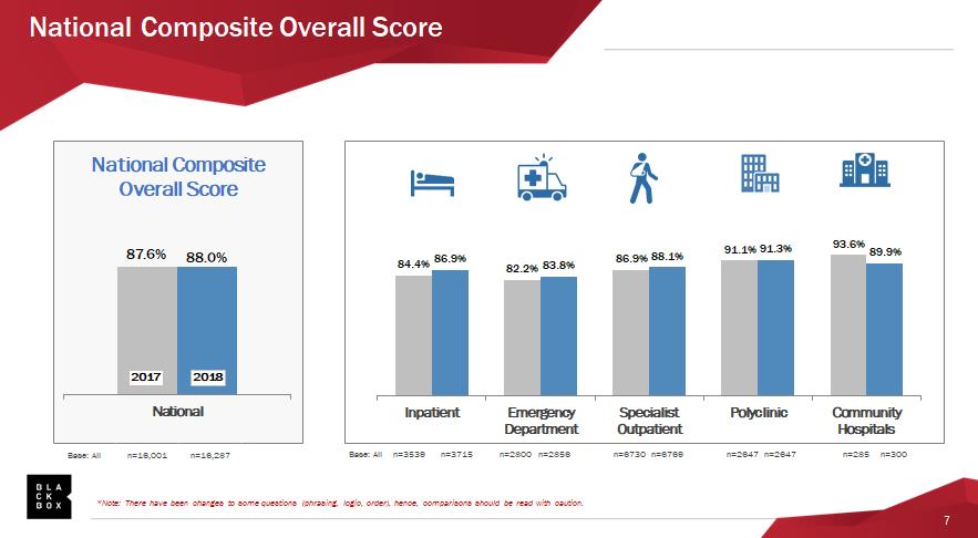
Below is an example of how to use icons to guide your audience through your presentation content. Sometimes, less words is more!

Want to learn more skills to take your presentations to another level? Be sure to select the "Presenting Yourself Powerfully" course offered by SingHealth Academy during your next LNA exercise. The 2 day course helps you to identify your weaknesses and apply the appropriate techniques to convey your message effectively to your audience.
Need more workplace tips? Let us know at joyatwork@singHealth.com.sg
